


The graph below gives information from a 2008 report about the consumption of energy in the USA since 1980 with projections until 2030.
Summaries the information by selecting and reporting the main features, and make comparisons where revelant.
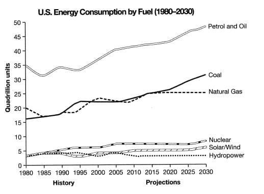
The line graph compares the amount of energy consumption, in quadrillion units, generated from six types of sources in the USA from 1980 to the present (2022) with the predicted trend for each until 2030.
Overall, clean energies have not been popular so far and will most probably not be for the foreseeable future. By contrast, fossil fuels, especially petrol and oil, will continue to have more share of the industry as they have since 1980.
Regarding the clean energies, their initial figures were equal at approximately 4q. While the consumption rates of nuclear power and solar or wind energy have risen a little and are expected to continue to increase to about 10q and 5q respectively, those of hydroelectricity, which have remained relatively constant so far, will not change until the end of the period.
In terms of fossil fuels, petrol and oil were by far the most used sources of energy in the USA with the number at 35q in 1980. This rate has risen to around 45q and is predicted to reach a little under 50q by the end of the period. Similarly, the initial shares of coal (nearly 16q) and natural gas (20q) have experienced rather similar upward trends throughout the years, but it is expected that the consumption of the former will continue to rise to around 30q and that of the latter will remain constant at around 25q during the final 15 years.
This sample was written in the year 2022, so if you are reading it in 2023 or later, please know that 2023+ was considered future to me while writing.