


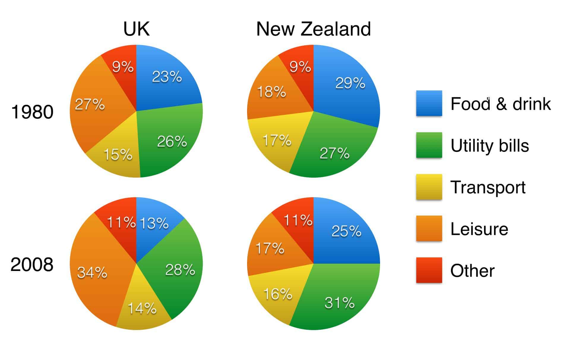
The charts show household spending patterns in two countries between 1980 and 2008.
Summaries the information by selecting and reporting the main features, and make comparisons where revelant.
The pie charts compare the proportions of the expenditure of people in the UK and New Zealand on five categories in the years 1980 and 2008. The categories include food and drink, utility bills, transport, leisure, and other expenses.
Overall, edible goods and utility bills accounted for the majority of the household expenditure in New Zealand in these two years. While British people allocated a significantly higher portion of their money on leisure activities in both years, the spending on transport and other costs remained relatively constant in both countries.
Regarding the edible products and utility bills, the British spent about a quarter of their household budgets on the former in 1980, while the corresponding figure for New Zealanders was at 29%. Twenty-eight years later, the figure for the UK declined to 13% and that of New Zealand reduced to a quarter of the budgets. As for utility bills, the proportion of expenditure in the UK, which was at 26% in 1980, increased by a mere 2%, and the one for New Zealanders rose to a little under a third of their spending.
In terms of leisure, transport, and other costs, initially, people in the UK and New Zealand allocated 27% and 18% of their budgets on leisure activities respectively. In 2008, the figures for the UK experienced a significant rise of 7%, whereas that of New Zealand decline by 1%. Finally, people in both countries spent approximately 15% of their money on transport and about 10% on other costs.